Mylens: Revolutionizing data visualization with AI
In the rapidly evolving world of artificial intelligence, tools that simplify complex data and enhance understanding are invaluable. Mylens stands out as a powerful AI-driven platform that transforms raw information into interactive, visually appealing formats.
This article explores Mylens’s features, uses, benefits, and practical applications, offering a comprehensive guide for AI enthusiasts, educators, researchers, and professionals.
1. Introduction to Mylens
What is Mylens?
Mylens is an innovative AI-powered platform designed to transform complex data, raw ideas, or content into clear, interactive, and editable visuals such as mind maps, timelines, flowcharts, and tables. By leveraging advanced algorithms, it processes large datasets, articles, videos, or other inputs to create visually engaging representations that simplify understanding and enhance communication. Whether you’re a student, educator, marketer, researcher, or business professional, Mylens offers a versatile solution to make sense of intricate information effortlessly.
The vision behind Mylens
Founded in 2023, Mylens aims to bridge the gap between complex data and human comprehension. Powered by Datamotto, a leader in AI-driven data solutions, the platform prioritizes user-friendly design, accessibility, and data security. Its mission is to empower users across industries to visualize and explore information interactively, fostering deeper insights and more effective decision-making. Unlike traditional visualization tools, Mylens combines real-time data processing with customizable outputs, making it a game-changer in the AI landscape.
Why Mylens matters in the AI ecosystem
In an era where information overload is a common challenge, Mylens stands out by offering a streamlined approach to data analysis and presentation. Its ability to handle diverse inputs—text, PDFs, images, webpages, or YouTube videos—and convert them into digestible visuals sets it apart from conventional tools. This flexibility makes it a valuable addition to any AI enthusiast’s toolkit, particularly for those seeking to enhance productivity and clarity in their work.
2. Key features of Mylens
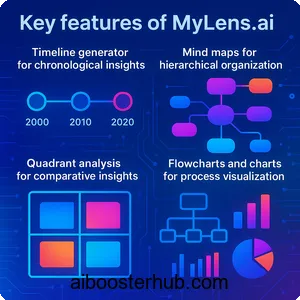
Timeline generator for chronological insights
One of Mylens’s standout features is its timeline generator, which creates detailed, interactive timelines for historical events, project plans, or any sequential data. Users can input a topic, such as “the history of artificial intelligence,” and the platform will generate a comprehensive timeline highlighting key milestones. The ability to combine multiple topics into a single timeline allows users to visualize overlapping events, providing a richer understanding of complex narratives.
Mind maps for hierarchical organization
Mylens excels at creating mind maps that organize ideas hierarchically, making it ideal for brainstorming, research, or project planning. By inputting documents, articles, or raw ideas, users can generate mind maps with infinite connections, perfect for exploring intricate topics like quantum computing or global economic trends. These mind maps are interactive, allowing users to dive deeper into specific nodes and uncover hidden insights.
Quadrant analysis for comparative insights
For users needing to compare data points or ideas, Mylens offers a quadrant analysis feature. This tool organizes information into four quadrants, enabling comparative analysis for tasks like market research or strategic planning. For example, a business analyst could use this feature to compare competitors based on innovation and market share, with the AI automatically categorizing data into an easy-to-read format.
Flowcharts and charts for process visualization
Mylens supports the creation of flowcharts, bar charts, line charts, and donut charts, which are perfect for visualizing processes, trends, or proportions. Flowcharts are particularly useful for mapping out decision paths or workflows, while charts provide a quick way to compare quantities or track progress over time. These visuals are not static; users can customize and edit them to suit specific needs, ensuring flexibility across applications.
Multi-format input processing
The platform’s ability to process diverse inputs—text, PDFs, images, webpages, and YouTube videos—sets it apart. For instance, users can upload a research paper, paste a webpage URL, or link a YouTube video, and Mylens will extract key insights and transform them into a chosen visual format. This versatility makes it a powerful tool for summarizing and presenting information from virtually any source.
Integration with external tools
Mylens integrates seamlessly with tools like Google Sheets and Microsoft Excel, allowing users to upload datasets and generate visuals directly from spreadsheets. Additionally, its Chrome extension enables one-click summarization of webpages or YouTube videos, embedding the platform into everyday browsing workflows. This integration enhances its utility for professionals who rely on multiple tools in their daily tasks.
3. Uses of Mylens across industries
Education and learning
In educational settings, Mylens revolutionizes how students and educators interact with information. Teachers can create dynamic visual aids, such as timelines of historical events or mind maps of scientific concepts, to make lessons more engaging. Students can use the platform to summarize lengthy articles or research papers into concise visuals, aiding comprehension and retention. The platform’s support for multiple languages ensures accessibility for diverse learners.
Business and marketing
For businesses, Mylens is a powerful tool for market research, competitive analysis, and strategic planning. Marketers can input customer feedback or survey data to generate insights in the form of quadrant diagrams or flowcharts, streamlining campaign planning. The platform’s ability to visualize complex datasets helps businesses identify patterns, optimize strategies, and communicate findings effectively to stakeholders.
Research and academia
Researchers benefit from Mylens’s ability to process large volumes of data, such as academic papers or historical records, and convert them into structured visuals. For example, a historian could input documents about the Industrial Revolution and receive a timeline or mind map highlighting key events and their interconnections. This feature saves time and enhances the ability to uncover trends and draw conclusions.
Financial analysis with MyLens Stock Market
A specialized version, MyLens Stock Market, caters to financial professionals by analyzing real-time stock data, news, and market trends. It generates visual boards displaying price trends, sentiment analysis, and SWOT evaluations, enabling traders and analysts to make informed decisions quickly. The platform’s ability to aggregate data from trusted sources like SEC filings and Bloomberg terminals ensures transparency and reliability.
Personal organization and project management
Individuals can use Mylens for personal projects, such as planning a novel, organizing a content calendar, or tracking personal goals. By inputting raw ideas or lists, users can create mind maps or timelines to structure their thoughts. The platform’s intuitive design makes it accessible for non-technical users, ensuring anyone can benefit from its visualization capabilities.
4. Benefits of using Mylens
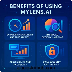
Enhanced productivity and time savings
Mylens significantly reduces the time required to process and present complex information. Instead of manually compiling timelines or charts, users can generate polished visuals in seconds. This efficiency is particularly valuable for professionals juggling tight deadlines or students preparing for exams, as it allows them to focus on analysis rather than data organization.
Improved decision-making
By transforming raw data into clear visuals, Mylens helps users identify patterns, correlations, and trends that might be missed in text-heavy reports. For example, a quadrant analysis of market data can reveal strategic opportunities, while a flowchart can clarify decision-making processes. This clarity empowers users to make informed, data-driven decisions.
Accessibility and inclusivity
The platform’s support for multiple languages and its user-friendly interface make it accessible to a global audience. Whether you’re a non-native English speaker or a beginner in data visualization, Mylens’s intuitive design ensures ease of use. Its free plan further democratizes access, allowing users with varying needs to explore its features.
Data security and privacy
Mylens prioritizes user privacy and data security, adhering to strict terms of use and privacy policies. While the platform retains a license to use and store content for service improvement, user-generated content remains their property. This commitment to security makes it a trustworthy choice for handling sensitive data, such as proprietary business information or academic research.
Versatility for diverse applications
From education to finance, Mylens’s versatility makes it a valuable tool across domains. Its ability to handle various input types and generate multiple visual formats ensures it meets the needs of different users, whether they’re creating a content calendar, analyzing stock trends, or exploring historical narratives.
5. How to use Mylens: A step-by-step guide
Step 1: Sign up and access the platform
To begin, visit the Mylens website and create an account. The sign-up process is straightforward, requiring basic information to set up your workspace. Once registered, you can access the platform’s features through the web interface or the Chrome extension for seamless integration with your browsing experience.
Step 2: Input your data or topic
Mylens accepts a wide range of inputs, including text, PDFs, images, webpages, or YouTube video URLs. For example, you can paste the text of an article, upload a CSV file, or enter a topic like “the evolution of machine learning.” The platform’s AI will process the input and extract relevant insights, ready for visualization.
Step 3: Choose your visualization type
Select the desired visual format—timeline, mind map, quadrant, flowchart, or chart—based on your needs. For instance, choose a timeline for chronological data or a mind map for brainstorming. Mylens offers customization options, allowing you to tailor the visual’s appearance and focus on specific aspects of the data.
Step 4: Analyze and refine the output
Once the visual is generated, you can interact with it by clicking on nodes or sections to explore deeper insights. The platform allows manual refinements, such as adjusting labels or reorganizing elements, to ensure the output aligns with your goals. This step is crucial for creating polished, presentation-ready visuals.
Step 5: Share or export your visual
Mylens makes it easy to share your visuals via downloadable files (e.g., PNGs) or shareable links. You can also export interactive widgets compatible with tools like Google Sheets or trading platforms for financial visuals. This flexibility ensures your visuals can be integrated into presentations, reports, or collaborative projects.
6. Why Mylens is a must-have for AI enthusiasts
A tool for the future of data interaction
As artificial intelligence continues to shape how we process information, Mylens positions itself as a forward-thinking tool that combines AI’s analytical power with human-centric visualization. Its ability to handle diverse inputs and generate interactive visuals makes it a must-have for anyone looking to stay ahead in the AI-driven world.
Community-driven innovation
Mylens actively incorporates user feedback to enhance its features, ensuring it evolves with the needs of its community. Posts on X highlight its popularity among AI enthusiasts, with users praising its ease of use and time-saving capabilities. This community-driven approach ensures Mylens remains relevant and user-focused.
Empowering creativity and clarity
Whether you’re a student exploring historical narratives, a marketer analyzing consumer trends, or a financial analyst tracking market signals, Mylens empowers you to see the big picture while uncovering hidden details. Its intuitive design and powerful AI make complex data accessible, sparking creativity and clarity in every project.
7. Conclusion
Mylens is more than just a visualization tool—it’s a gateway to understanding and communicating complex information with ease. By transforming raw data into interactive, shareable visuals, it empowers users across industries to work smarter, not harder. For AI enthusiasts, Mylens is a must-try tool that blends cutting-edge technology with practical applications, making it an essential addition to any digital toolkit.